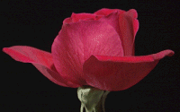
Outline Shift Filter
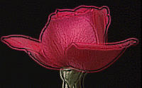
Never one for names, I've called this the Outline Shift Filter because that's what it looks like it does to me.


Goto Image | User Defined Filters..., select a New... filter and enter the following information into the filter matrix:
1 0 1 0 1 0 1 0 1 0 1 0 1 0 1 0 1 0 1 0 1 0 0 0 -13 0 0 0 1 0 0 0 0 0 1 0 1 0 1 0 1 0 1 0 1 0 1 0 1 Division Factor: 6
Bias: 0
Increasing the centre value (more negative) will make the actual image darker, but not affect the outline around the image. This makes it look like some kind of edge detect. Decreasing the centre value (more positive) simply makes the image appear overexposed with an outline. Increasing the division factor decreases the brightness of the overall image, while decreasing it brightens the image and makes it more grainy in appearance.
Once again the bias seems to be brightening the image when increased in large amounts (50 to 200) and saturating the image when decreased in large amounts (-50 to -200). Bringing the bias down to -50 has a nice reddening effect on the rose.
The effect on text is also interesting. It creates a glow effect, but with a semi-three dimensional look because it also shades the inside of the letters.

|