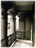
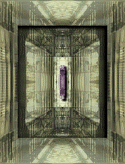
Architechture I This is the first image exploration that I've actually put together into an exploration. I think it's interesting how a balcony with a set of columns gets transformed into something looking like a circuit board. Since I got the image from an architechture site, I tried to keep space in mind during the exploration.
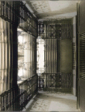
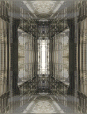
First, I made a duplicate of the image and flipped it [Image | Flip]. Then I used Image | Arithmetic... to add the two images together (figure 1). This produced an interesting optical illusion, because it still looked like the beginning image in strong ways, but was at the same time quite different. Taking the symmetry principal further, I took the resulting image, made a duplicate of that and mirrored the duplicate [Image | Mirror]. I added the two mirrored images together to get figure 2. This evoked some sort of Giger imagery for me.
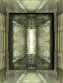
Next I increased the amount of red and green in the image using Colors | Adjust | Red/Green/Blue... to give it more feeling. As I was doing this I started noticing the result looked a little like a circuit board. The image was still a little flat though, so I selected a square outlined by the two dark stripes you see in figure two and performed a Image | Special Effects | Cutout... with a vertical offset of 3 and a horizontal offset of -3. The bottom and left edges seemed a little undefined so I did the cutout special effect again with a vertical offset of -1 and a horizontal offset of 1. This produced the image in figure three, while produced a two-layer look.
I thought the centre white area looked a little like a flourescent light and experimented a while with trying to make it glow. Instead I made a duplicate of the image and colored it violet with Colors | Colorize... I then highlighted the centre flourescent bulb with the Magic Wand, copied the violet image and pasted it into the selection of the first image using Edit | Paste | Into Selection. This got rid of the empty white space and gave the centre space a little bit more dimension, but the violet now looked a little out of place.
While it was still highlighted I added a drop shadow with Image | Special Effects | Drop Shadow... This gave it a look I was satisfied. For the image in the title I also buttonised it using Image | Special Effects | Buttonize...
|
